Your best photo is usually the wrong one to upload
Most people upload their best photo, because that is what the word upload usually asks for. But a reference frame is not a portfolio piece: it is a description of an object, and it is judged on how much it tells you rather than how good it makes the product look. The two are chosen on opposite criteria, and the hero shot usually loses.
Published · updated — written and checked by hand.
Open the folder of photos you have of the thing you sell. There will be one you reach for first — the one on the listing, the one in the ad, the one you would show somebody who asked what you make. It is styled, it is cropped close, the light is doing something, and there is probably a hand or a linen napkin or a shaft of afternoon sun in it somewhere.
That is the photo almost everybody uploads, and it is usually the worst one in the folder for the job.
Two photos, two different jobs
A listing photo is an argument. Its job is to make somebody want the object, and every technique available to it works by removing information: crop away the parts that do not help, throw the background out of focus, let a shadow hide the join, angle it so the least flattering side is not visible. A good hero shot is a well-edited case for the product.
A reference frame is a description. Its job is to tell a system what the object actually is — its shape, its proportions, what it is made of, where the logo sits, how the surfaces meet. Every frame of the film is conditioned on it, so anything the photo does not show has to be inferred, and anything it hides stays hidden. The reference is judged on completeness, and the hero shot is optimised for the opposite.
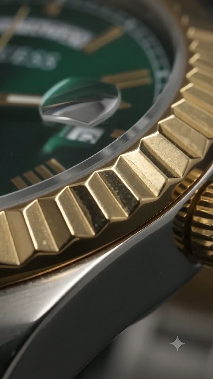
So the two selections pull apart. The styled shot with the strap coiled artfully out of frame is the better advertisement and the poorer brief. The flat, slightly boring photo you took on the kitchen table to check a colour — whole object, even light, nothing hidden — is the better brief and an advertisement you would never run.
What the inversion looks like in practice
The properties that make a listing photo good are, one for one, the properties that cost a reference frame information:
- A tight crop sells the detail and removes the proportions. If the frame stops at the edge of the object, nothing in it says how the parts relate to each other.
- A shallow depth of field isolates the subject and dissolves the back half of it. Whatever is soft is a guess.
- Dramatic side light gives the product shape and blows out the highlight on the one polished surface a buyer cares about. What is clipped to white is gone, not dark.
- Props and a lifestyle setting build the mood and introduce objects that are not the product. A hand, a cloth, a second item in the frame all have to be told apart from the thing being filmed.
- A flattering three-quarter angle hides the side you like least — and a side no photo shows is a side the camera will not turn onto, so the angle you chose to flatter the product also decides how far the film can move.
None of that makes the hero shot a bad photograph. It makes it a bad description, which is a different complaint, and it is the only one that matters at the moment you are choosing a file.
The thirty-second version
Look through what you already have and pick on three questions, in this order. Is the whole object in the frame? Can you read whatever text is on it? Is the light even enough that no surface is a white blank or a black hole? The first photo that answers yes three times is your upload, and it does not matter at all whether you like it.
If two photos both pass, take the plainer one. If none of them do, the fix is a phone, a sheet of paper and daylight — thirty seconds of work, and the answer page on what to upload sets out exactly what to aim for.
When the styled shot is the only shot
Sometimes there is no plain photo, because the product was shot once, professionally, and that session is what you have. This is the normal case for anyone who sells something they did not make themselves, and for anyone whose supplier sent them a catalogue image and nothing else.
The move then is not to force one frame to do everything, but to spread the description across several. A styled hero that hides the back, plus a flat packshot that shows it, plus a close crop of the engraving, together describe the object better than any one of them does alone — and several angles is exactly what the shoot can use. The set does not have to be consistent in mood or lighting, because you are not asking it to be a gallery. You are asking it to answer questions about an object, and different photographs can answer different ones.
If you genuinely have one image and it is the styled one, upload it anyway and look at the free preview before you spend anything. That is what the preview is for. The failure this post is warning about is not using an imperfect photo — it is reaching past a better photo you already had, because it looked worse.
Why this is worth a paragraph of your attention
Because it is the one decision in the whole process that nothing downstream can undo. The mood can be changed and the shoot run again. The ratio can be chosen again. But the reference is the floor: it is the description everything else is built on, and a shoot briefed from a photograph that hid half the product will keep producing films that are confident about the wrong shape.
The good news is that this is the cheapest possible thing to get right. It costs no money and no skill — it costs the willingness to upload a photo you do not think is very good, which turns out to be the hard part.
Read enough? Watch your own product.
One photo in — a cinematic 10-second video and a full set of marketing photos out. Your first one is free.